Visual Branding for Musicians: Platform-by-Platform Guide
If your Spotify, TikTok, YouTube, and Instagram all look different, fans notice it fast. I’d keep one visual system across every platform, then change only the crop, file size, and text use for each one.
Here’s the short version:
- I’d use one main profile photo across platforms
- I’d keep the same colors, fonts, and photo style
- I’d build around 4 base formats:
- 1:1 for avatars and cover art
- 4:5 for Instagram feed posts
- 9:16 for Reels, TikTok, Shorts, and Canvas
- wide banners for YouTube and artist pages
- I’d keep faces, logos, and titles inside the center 60%–70% of the frame
- I’d remove promo text from Spotify and Apple Music images
- I’d test every asset on mobile before publishing
One stat stood out to me: artists with a steady visual identity and custom branding and sonic brand saw 28%–45% higher Spotify save rates in the data cited in the article.
How to Visually Upgrade Your Music Brand: Art Direction Playbook (Mau P Edition)
sbb-itb-e819543
Quick comparison
| Platform | What matters most | Best visual move |
|---|---|---|
| Feed posts, Reels, profile crop | Use 4:5 posts and keep grid styling matched | |
| TikTok | Profile image, cover readability | Keep text in the center so grid crops don’t hide it |
| YouTube | Banner safe zone, thumbnails, Shorts | Use one thumbnail layout and protect the center banner area |
| Spotify | Circle avatar, header crop, Canvas | Use clean, text-free images and a centered subject |
| Apple Music | Publicity photos | Upload high-res evergreen photos with no promo text |
| Artist pages | Link hub design | Match your hero image, colors, and CTA styling to your release campaign |
What I like about this approach is that it cuts wasted work. You’re not making six brands. You’re making one look and exporting it the right way for each platform.
Core Specs: Master Asset Sizes, Safe Crops, and Reusable Formats
Base Formats That Work Across Most Platforms
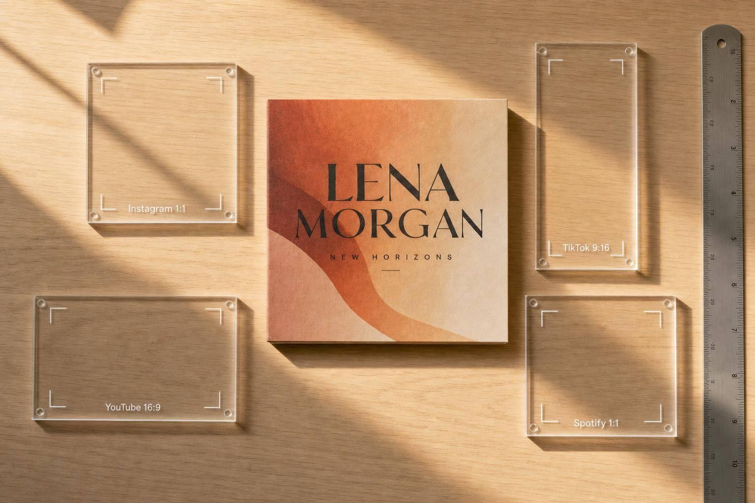
Once your brand kit is ready, turn it into crops you can use almost everywhere. The simplest way to do that is to build around four aspect ratios that cover most music marketing needs.
A 1:1 square works for profile avatars and cover art on Spotify, Apple Music, and Instagram. A 4:5 portrait gives you more vertical space in the Instagram mobile feed, which helps your post stand out a bit more. A 9:16 vertical at 1080 × 1920 px fits the screen on TikTok, Reels, Shorts, and Spotify Canvas. Then there’s the wide banner layout, which you’ll need for YouTube channel headers and artist page hero images.
Here’s the part that saves time: export every version from the same high-resolution source file. That way, your smaller crops stay sharp instead of looking soft or stretched.
Keep Branding Readable in Circles, Thumbnails, and Mobile Safe Zones
Platform crops can be unforgiving. Profile images often get clipped into circles, thumbnails shrink fast, and banner views change from one device to the next. So if your face, logo, or title sits too close to the edge, it can disappear in a hurry.
Keep key elements centered and leave extra padding around them. That buffer helps protect your design when a platform applies a circular crop. It also helps when images get squeezed down to icon size, where small details tend to vanish. In those cases, high contrast, minimal text, and a strong silhouette do a lot of the heavy lifting.
Banners need the same kind of care. YouTube recommends a 1,235 × 338 px safe area centered inside a 2,560 × 1,440 px upload. Anything outside that area might not show on mobile or TV. Spotify headers have a similar challenge: one file has to read well across desktop, web, and TV views.
Quick Spec Table for Common Music Marketing Formats
| Aspect Ratio | Common Use | Design Notes |
|---|---|---|
| 1:1 | Avatars, cover art, artist photos | Center the subject; Spotify avatar minimum is 750 × 750 px. |
| 4:5 | Instagram feed posts | Use 1080 × 1350 px for strong mobile feed visibility. |
| 9:16 | Reels, TikTok, Shorts, Spotify Canvas | Export at 1080 × 1920 px; fills mobile screen natively. |
| Wide banner | YouTube channel art, Spotify headers, artist pages | Keep key elements inside the center safe zone; YouTube minimum upload is 2048 × 1152 px. |
Use these master specs as the starting point for each platform’s exact upload rules.
Platform-by-Platform Visual Branding Guide
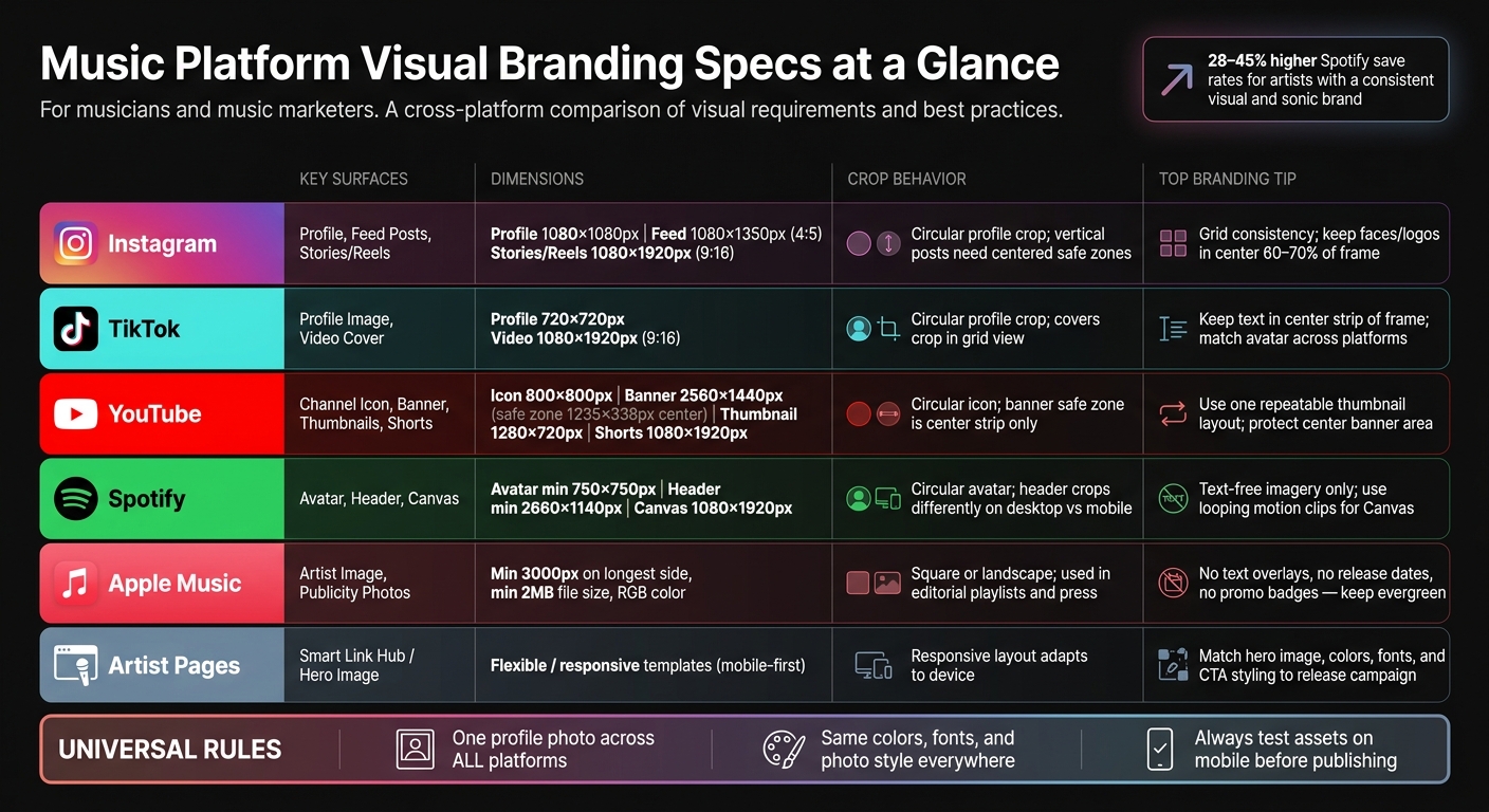
Music Platform Visual Branding Specs: The Complete Comparison Guide
Instagram and TikTok: Profile Images, Vertical Posts, Covers, and Grid Consistency
Once your master sizes and safe zones are set, the next step is simple: use them for music promotion across platforms without losing the look. Same brand, different crop.
Start with one 9:16 master template for Reels and TikTok. From there, export a square profile image with the main subject centered so it still looks right inside the circular crop. For Instagram feed posts, 4:5 gives you the most vertical space on mobile. On TikTok, place your title or main visual in the center strip of the frame so it stays readable in grid view. Faces, logos, and titles should stay centered so app UI and grid crops don't cover them.
To keep both platforms tied together, stick with the same color grade, the same one or two fonts, and the same profile image. Then change only the crop when needed. Use the same text hierarchy for every release post: song title largest, artist name smaller, date smallest.
That same vertical master works for Shorts too, which keeps the workflow simple.
YouTube: Channel Icon, Banner Safe Zone, Thumbnails, and Shorts
Same brand, just in a wider format. The goal on YouTube is to use one visual system across your icon, banner, thumbnails, and Shorts.
The channel icon shows up as a small circle across YouTube - in search results, comments, and on your channel page - so use a close, well-lit portrait or a high-contrast logo. The channel banner uploads at 2,560 × 1,440 px, but only the center safe zone is sure to appear across desktop, mobile, and TV. Put your artist name, logo, and any key text inside that middle strip.
For thumbnails, export at 1,280 × 720 px. Use one repeatable layout: photo, short title, and one fixed brand marker. That layout can carry across music videos, lyric videos, live sessions, and behind-the-scenes posts. Only the photo and title need to change. YouTube Shorts use the same 9:16 vertical format as Reels and TikTok, so your master template fits here too.
After social video, shift into cleaner, text-free visuals for streaming profiles and artist pages.
Spotify, Apple Music, and Artist Pages: Avatars, Headers, Publicity Photos, and Link Hubs
Same brand, cleaner presentation. For streaming profiles, use clean images without text. Save promo graphics for social posts.
On Spotify, your avatar appears in a circle, so keep the subject centered and leave clear padding. The header image should also keep the main subject in the center so it can handle different crops across desktop and mobile. Canvas uses a short vertical loop in the Now Playing view. The best Canvas pieces often come from existing vertical video clips with the text removed, letting the mood do the work.
Apple Music asks for 3–5 publicity photos at a minimum of 3,000 pixels on the longest side, at least 2 MB, and in RGB color. Skip text overlays, release dates, and “out now” badges. These photos may appear in editorial playlists and press materials, so they need to stay evergreen.
Artist pages help move people from social discovery to listening, pre-save campaigns, and email signups. PromoLinks.me can carry the same hero image, colors, typography, pre-save links, QR codes, and analytics across artist pages. Using the same cover art or key portrait across your PromoLinks artist page, streaming headers, and social posts creates a smooth path from discovery to listening.
Platform Spec Table
Use the table below as a final check before export.
| Platform | Key Branding Surface | Dimensions / Ratio | Crop Behavior | Branding Priority |
|---|---|---|---|---|
| Profile, Feed, Stories/Reels | 1080×1080 (profile), 1080×1350 (feed), 1080×1920 (Stories/Reels) | Circular profile crop; vertical posts need centered safe zones | Grid consistency; safe zone for Stories UI | |
| TikTok | Profile, Video Cover | 720×720 px recommended (profile), 1080×1920 (video) | Circular profile crop; covers crop in grid view | Centered text in cover safe zone; matching avatar |
| YouTube | Channel Icon, Banner, Thumbnails, Shorts | 800×800 px (icon), 2560×1440 (banner), 1280×720 (thumbnail), 1080×1920 (Shorts) | Circular icon; banner safe zone 1546×423 px center | Safe zone for banners; repeatable thumbnail layout |
| Spotify | Avatar, Header, Canvas | 750×750 px min (avatar), 2660×1140 px min (header), 1080×1920 (Canvas) | Circular avatar; header crops on mobile | Text-free imagery; looping motion for Canvas |
| Apple Music | Artist Image, Publicity Photos | 3,000 px min on longest side, 2 MB min | Square or landscape; editorial use | High-res, no text overlays, evergreen portraits |
| Artist Pages | Smart Link Hub | Flexible / responsive templates | Mobile-first responsive layout | Unified colors, fonts, and campaign imagery |
Common Visual Branding Mistakes Across Music Platforms
Even if you use the right image sizes, a few simple slip-ups can wreck consistency in no time.
Using Different Profile Photos, Colors, and Type Styles on Every Platform
The mistake artists make most often is using a different profile photo on each platform. When that happens, one artist can look like three separate acts. Use the same face, color palette, and type style so fans spot you right away.
Pick one main profile image. Then use the same color grading across every platform and stick with one headline font plus one supporting font for thumbnails, story slides, and release graphics. Frequent rebrands can wipe out recognition and make people start from scratch.
Letting Crops Hide Faces, Logos, or Text
Always check the image on the actual platform before you publish it, not just inside your design file.
A simple rule helps here: keep faces and logos inside the center 60–70% of the frame. Then test avatars, banners, and thumbnails on a phone before posting. What looks fine on a big screen can fall apart fast on mobile.
Overloading Streaming and Artist Images With Promotional Text
Streaming platforms are not poster walls. Spotify and Apple Music explicitly advise against text, advertising, tour dates, and release promo in artist photos and profile images. Add promo text to a streaming avatar, and it usually looks messy at small sizes. On mobile, people often can’t read it at all.
Keep promo copy on social channels and artist pages. Keep streaming art clean. Skip promo text in streaming images, and save it for social posts and artist pages, where release details belong.
Once you fix these issues, the next move is to turn them into a release checklist.
Turn Your Brand System Into a Repeatable Release Workflow
Once your specs are locked in, the next step is simple: turn them into a release workflow you can use again and again.
Build a Release Asset Checklist for Every Campaign
Use one master checklist for every release. It helps keep each campaign lined up with the same visual system, so you’re not rebuilding the process from scratch every time.
Your checklist should cover the core assets for every launch:
- Profile images across all platforms
- Square cover art
- A 9:16 promo clip
- YouTube thumbnails
- An artist page banner
- Story graphics
Then add only the extras tied to that campaign. For example, that might mean pre-save art for singles, tracklist visuals for EPs and albums, or tour graphics for shows.
Try to have everything finalized 1–2 weeks before release day. That extra time matters. It gives you room to catch bad crops, fix sizing problems, and see how the assets look on mobile before anything goes live.
Use Artist Pages and Analytics to See Which Visuals Drive Clicks
A steady visual system shouldn’t just look clean. It should also show you what gets people to click.
Use one branded smart link hub as the visual home base for each release. PromoLinks.me lets you build customizable artist pages and smart links, run pre-save campaigns, and capture fan emails with QR codes. Check out our music promotion guides for more strategy tips. You can also use its analytics to compare which artwork, portrait style, and CTA layout get more clicks and signups.
That’s the part a lot of artists miss. A visual choice isn’t just a design choice. It’s also a performance signal. If one cover style gets more taps than another, that tells you what to keep using and what to change in the next campaign.
A Simple Publish-Once Workflow for Every Release Week
This is where your brand kit, crop rules, and platform specs turn into a launch process you can repeat each week. Once the assets are ready, run the same sequence every time:
- Update your artist page with the new cover, headline, call-to-action, and destination links. Generate a QR code if you're using physical promo materials.
- Export all crops from your master file - square cover, vertical story and post versions, YouTube thumbnails, and banner and header versions.
- Upload and update platform images on Instagram, TikTok, YouTube, Spotify, and Apple Music in one focused session.
- Check mobile previews on a phone: avatar crop, banner safe zone, and thumbnail readability.
- Confirm everything matches your brand kit before scheduling posts and emails.
Write this sequence down once, then reuse it every release week. The title, date, and artwork may change. The process stays the same.
Conclusion: Keep the Look Consistent, Adjust the Crop for the Platform
After all the platform-by-platform specs, the rule is pretty simple: build one visual system, then export it in crops that fit each platform.
That means keeping the same profile photo, color palette, typefaces, and photography style across every channel. The look should stay steady, even when the dimensions change.
Think of these platform rules as export settings for one master system. Circular avatars, banner safe zones, and text-free streaming images are formatting rules, not a reason to redo your brand. Keep the brand fixed. Change only the frame.
One visual system. Different crops. Same artist.
FAQs
How do I build one visual system for every platform?
Keep your visual system consistent across platforms. Stick with one color palette and one font style pulled from your cover art. Use high-quality images too, like a centered portrait for avatars and wide banner images. And skip text on those visuals.
On your PromoLinks.me artist page, match the template, background, theme colors, and fonts to the rest of your look. Using one branded artist page and smart links keeps the experience consistent wherever fans find you.
Which image sizes should I create first?
Start with 3,000 x 3,000 px cover art. It works across smart links, pre-save pages, and streaming platforms.
Then make a few supporting assets:
- A profile avatar at 750 x 750 px minimum
- A header banner at 2,660 x 1,140 px minimum
- Social assets in 1,080 x 1,920, 1,300 x 740, and 1,080 x 1,080
When should I use text in music visuals?
Avoid putting text or promo copy in profile or header images. Most platforms discourage it, and those images usually work better when they stay clean and easy to scan.
Instead, add context in the parts of your artist page built for text. That can include lyrics, production notes, behind-the-scenes stories, release bios, or collaboration credits.
For links, skip generic labels. Use button text that tells people what they’ll get, like Listen to the new single, Read the full story, or See tour dates.
Related Blog Posts
Ready to create your smart links?
Join thousands of artists using PromoLinks to promote their music smarter.
Get Started Free