Mobile-First vs Desktop-First Label Page Design
I’d start mobile-first for a single-release campaign and desktop-first for a catalog fans need to browse. Either way, I’d keep the main listening button easy to find on phones and computers - and aim for featured artwork to load within 2.5 seconds.
I’d base the choice on your device traffic, release goals, content volume, and time for updates - not screen size alone. Following a music marketing checklist ensures these technical choices align with your overall campaign strategy.
Quick Comparison
| What I’d compare | Mobile-first | Desktop-first |
|---|---|---|
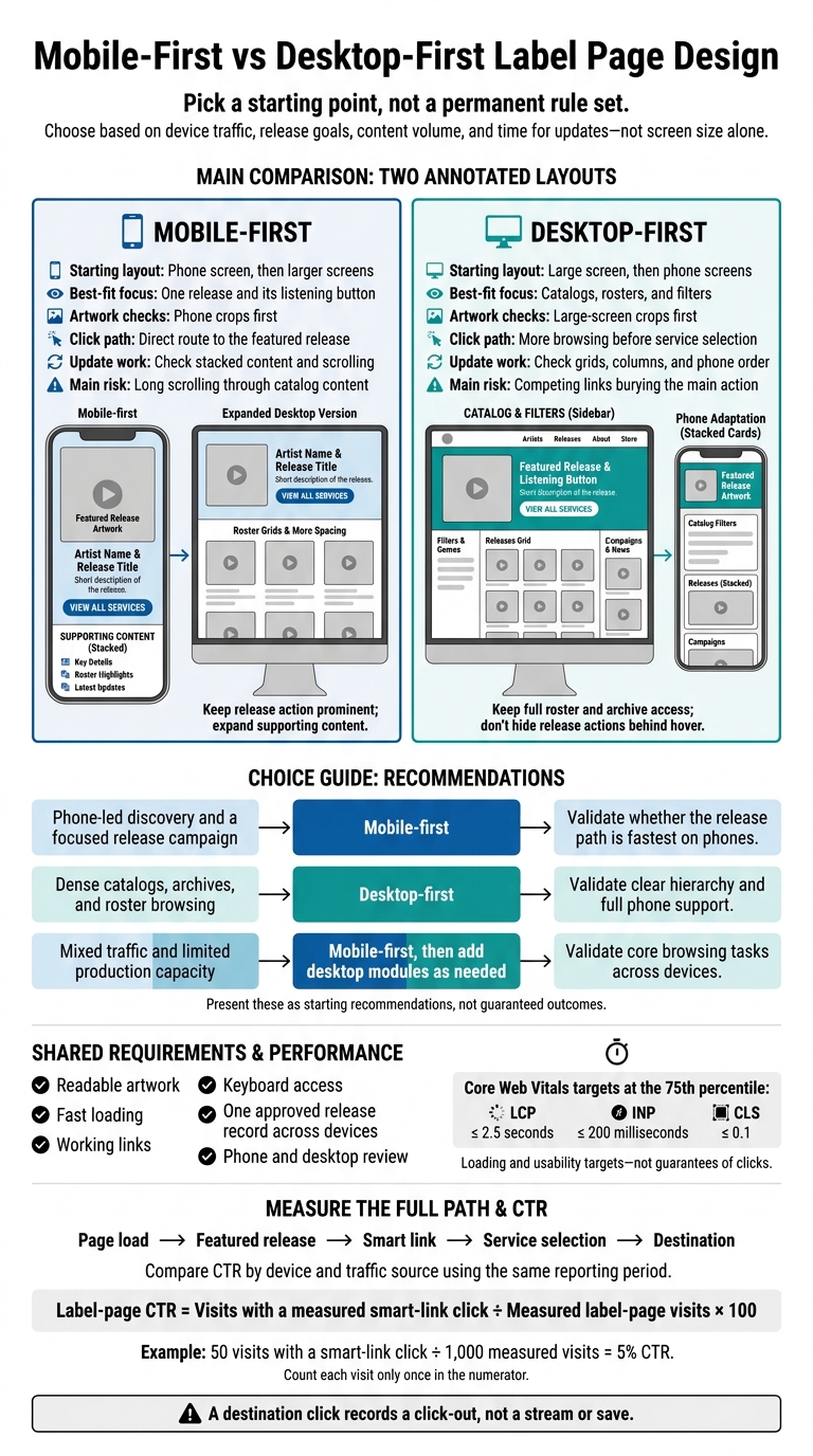
| Starting layout | Phone screen, then larger screens | Large screen, then phone screens |
| Main focus | One release and its listening button | Catalogs, rosters, and filters |
| Artwork checks | Phone crops first | Large-screen crops first |
| Click path | Direct route to the featured release | More browsing before service selection |
| Update work | Check stacked content and scrolling | Check grids, columns, and phone order |
| Main risk | Long scrolling through catalog content | Competing links burying the main action |
My checks stay the same: readable artwork, fast loading, working links, keyboard access, and one approved release record across devices. A shared tool such as PromoLinks.me may help with publishing, but I’d still review each update.
Then I’d compare click-through rates by device and traffic source. For example, 50 visits with a smart-link click out of 1,000 measured visits equals a 5% CTR. <u>A service click is not proof of a stream or save.</u>
Mobile-First vs Desktop-First Label Page Design
Advanced CSS (2025) - Epic #26 - Mobile First vs Desktop First & Breakpoints | Jonas Schmedtmann
sbb-itb-e819543
Mobile-First: Plan for Phone Screens
Start with the smallest phone viewport and sort content into three priorities: must-have, supporting, and optional. Genre and artist links support the release. Long biographies, videos, and secondary campaign graphics can sit farther down the page. Most mobile visitors arrive for one release, so give them a direct path from landing to tapping.
Create a Single-Column Release Path
The first screen should help visitors get to the stream fast. Arrange the page in this order: label identity, featured artwork, artist and release title, short description, primary smart link, key details, roster, and updates.
Use specific button labels such as “Listen on Spotify,” “Pre-save the album,” or “View all services” instead of vague labels like “Click here.”
Place the button beside the release information - not inside a menu.
Use full-width buttons with plenty of space between them. 48 × 48 CSS pixels is a practical minimum target size. This helps visitors follow the release path with one hand. Test small and large phones, landscape orientation, and enlarged text. Visitors should be able to reach the release link without horizontal scrolling, cut-off labels, or overlapping controls.
Prepare Artwork for Each Screen Size
Compress artwork and provide multiple sizes with srcset and sizes. Use picture when the crop changes. Keep the focal point in view and any overlays readable. Put the artist name, release title, and date in HTML text, not just on the cover. Add descriptive alt text and explicit image dimensions so the browser reserves space before the artwork loads.
Load featured artwork first and lazy-load roster images farther down the page. Limit autoplay and render-blocking scripts. Track Core Web Vitals using real mobile traffic, with these targets at the 75th percentile: LCP at or below 2.5 seconds, INP at or below 200 milliseconds, and CLS at or below 0.1. These metrics measure loading and usability; they don't guarantee clicks.
On larger screens, add roster grids, artist details, and more spacing while keeping the featured release action prominent. Desktop-first pages can expand the same release into a catalog view without burying the primary action.
Desktop-First: Plan for Catalog Browsing
Desktop-first works well for dense release archives and artist directories where fans want to browse and compare. Start by mapping the catalog, navigation, featured release, and filters in a desktop layout. Use flexible columns instead of fixed widths, and plan how they’ll stack on mobile from the start. Nothing important should disappear when the screen gets smaller. The desktop page should let fans browse, compare, and filter before they click through.
Arrange Rosters and Campaigns in Columns
A desktop-first label page should make the catalog easy to scan. Use expanded navigation for Artists, Releases, Playlists, Events, and About. Give each area a clear job: filters go in a sidebar, releases in the main grid, and campaigns in a side column.
Place the featured release above the catalog, with a primary button that stands out. Keep card fields consistent - artist, title, release date, and release type - so fans know where to look. Add artist or year filters, plus a clearly labeled reset control.
Fit Desktop Layouts to Phone Screens
Keep the same priorities when the layout shifts to a phone screen. Turn columns into stacked cards and move filters into a labeled drawer or panel. The phone menu should still provide access to the full roster and archive.
On phones, show the featured release and smart link vs Feature.fm first, followed by campaigns, roster, archive, and label info. Don’t hide release actions or details behind hover. Use visible controls that work with touch and keyboard input, too. Keep the page structure in a logical reading order rather than relying only on visual repositioning.
Use an alternate artwork crop for narrow screens, and keep text away from busy parts of the image. Check browser requests for hidden desktop images that still load. Before publishing, test phones, tablets, and laptops for artwork clarity, contrast, menu access, and content order. Include a 320-CSS-pixel reflow check to catch missing content and horizontal scrolling.
Compare Layouts, Fan Behavior, and Smart Link Clicks
Use these patterns to plan, not to predict results. The real test is which layout gets fans to the primary release action fastest.
| Decision factor | Mobile-first | Desktop-first |
|---|---|---|
| Click path | Gives fans direct access to one release | Supports browsing, but competing actions can delay clicks |
| Scan speed | Makes one release easy to scan | Makes multiple releases easier to compare |
| Update burden | Fewer modules can simplify release updates | More modules need consistency checks |
| Mobile risk | Secondary catalog content can lead to long scrolling | Dense layouts can bury the primary action |
Measure Clicks by Device and Traffic Source
Use metrics to see which layout fits your traffic mix. Mobile social and QR traffic may behave differently from desktop catalog traffic, but treat those patterns as tests - not fixed audience types. Split visits and clicks by device, source, release, and page version. Keep UTM tags consistent across social, email, and QR traffic. Using custom domains for artist branding can further improve trust and click-through rates across these channels.
Define label-page click-through rate as:
[ \text{Label-page CTR}=\frac{\text{Visits with a measured smart-link click}}{\text{Measured label-page visits}}\times 100 ]
Use the same reporting period for both counts, and count each visit only once in the numerator. Document whether “visits” means sessions or another measurement unit. Track Spotify, Apple Music, and YouTube selections separately from the first smart-link click.
Read clicks alongside scroll depth, session length, and bounce rate. Deep scrolling might show catalog interest - or a buried CTA. A short session might mean someone clicked successfully. A long session might mean browsing or confusion. Interpret bounce rate based on the interactions your analytics records, then check those patterns with tests on actual devices.
After comparing layouts, verify the full path from page load to service selection.
Test the Path to Streaming Services
Test page load → featured release → smart link → service selection → destination. Use representative iPhones, Android phones, and desktop browsers. Check keyboard access, visible focus, touch controls, artwork clarity, and loading on a slower connection. A 44-by-44 CSS-pixel touch target is a useful accessibility benchmark.
An outbound service click records a selection, not a stream start. Before crediting a layout change, compare similar releases and matching traffic sources over the same period. Record the change date, and keep artwork, copy, promo timing, and destination links stable.
Compare Release Updates for Small Teams
Once the page layout is set, small teams need a publishing order that keeps the same primary action on every device. Both workflows require phone and desktop review. The difference is which screen you check first. Start with the featured release and primary smart link.
| Update task | Mobile-first workflow | Desktop-first workflow |
|---|---|---|
| Feature a new release | Check narrow-screen hierarchy | Check wide-screen module |
| Replace artwork | Check narrow crops | Check wide crops |
| Add roster entries | Check stacked cards | Check grid balance |
| Add an event or campaign | Check phone scroll impact | Check desktop placement |
| Publish changes | Verify the featured release leads the phone layout | Verify the featured release stands out above the catalog |
With the layout settled, keep the approved page state consistent as releases change.
Set Release Fields and Publishing Checks
Keep one approved record per release with core metadata, destinations, artwork, alt text, featured status, and campaign details. For events, add the venue, city, date, time, and time zone. Use U.S. date and number formats. Save the high-resolution master, record approved crops and dimensions, and use consistent filenames.
Example filename:
artist-release-cover-v02.jpg.
Assign an update owner, reviewer, and final approver. One person can fill multiple roles. Store approved URLs and artwork together, and log the publication time and changed fields. Save a rollback copy of the previous page state so the team can undo an incorrect update without rebuilding the page.
Keep the same content hierarchy across screens. Use one short publishing checklist for releases, roster entries, events, and artwork: content order, primary action, approved crops, working links, and clean phone and desktop layouts. Run it after entering content, repeat affected checks after layout changes, and make one final pass before publishing.
Manage Campaign Pages With PromoLinks.me
PromoLinks.me can support teams that manage updates in one place. It offers label pages, smart links, pre-saves, templates, pre-save campaigns, QR codes, event pages, analytics, and fan email capture.
Before building your workflow around it, check current plan limits, responsive editing controls, available device and source metrics, export or ownership options, and support for the campaign elements you need. It fits either workflow, but the team still owns the publishing checks: content priority, artwork approval, link testing, and accessibility.
Conclusion: Choose Based on Traffic, Content, and Team Capacity
Choose the layout that fits how fans arrive and browse. Pick a starting point, not a permanent rule set. Let traffic sources, campaign goals, and content depth guide your choice, then check the fit against your traffic data.
Use this table to match your layout approach to traffic patterns and page complexity.
| Label-page priority | Starting approach to consider | What to validate |
|---|---|---|
| Phone-led discovery and a focused release campaign | Mobile-first | Whether the release path is fastest on phones |
| Dense catalogs, archives, and roster browsing | Desktop-first | Clear hierarchy and full phone support |
| Mixed traffic and limited production capacity | Mobile-first, then add desktop modules as needed | Whether core browsing tasks work across devices |
Keep updates simple and consistent across devices with one reusable responsive layout and one accountable update owner. Before launch, test on iPhone, Android, tablet, and desktop, including slow connections. Check keyboard access, text zoom, contrast, and screen-reader usability - not just whether the columns fit.
After each release cycle, review device-level traffic and smart-link performance. Compare destination clicks and click-through rates using the same date range and traffic sources, then make one or two fixes. A destination click records a click-out, not a stream or save. Use it to check the release page’s path to the target streaming service.
FAQs
Can I switch design approaches without rebuilding my label page?
Yes. PromoLinks.me lets you change your page’s design without rebuilding it or changing its URL. In the editor, you can switch layouts, reorder buttons and content sections, or swap hero images - even when moving from a single-release call to action to an artist hub layout.
Before saving, check your changes in mobile and desktop views using the live preview.
How can I test layouts with limited traffic?
When traffic is low, focus on manual checks and PromoLinks.me analytics. Before publishing, use the editor’s live preview to check button spacing, artwork cropping, and responsiveness on mobile and desktop. Test the entire pre-save or conversion flow on recent iPhones and mid-range Android phones.
If your conversion rate drops below 10%, check device-specific performance in the dashboard. Then test one change at a time, such as button order or layout.
Which page updates should my small team prioritize?
Let click data guide your updates. Move buttons for the most-clicked platforms to the top, and update tour dates, merch, or videos as they become available. If conversion rates fall below 10%, audit your layout and call to action right away.
With PromoLinks.me, you can update pages without changing your shareable URL. Links in existing social bios, QR codes, and press materials keep working and stay aligned with your campaign goals.
Related Blog Posts
Ready to create your smart links?
Join thousands of artists using PromoLinks to promote their music smarter.
Get Started Free